

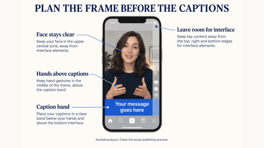
A vertical clip can look perfectly framed in an editor and become crowded after it is published. Platform controls cover the lower and right edges, captions rise across the subject, and a face that was centered now sits behind text. The problem is not simply cropping. It is a failure to plan for the interface that will surround the video.
For a Seedance 2.5 vertical video, plan faces, hand movements, products, and the caption band together before generating. Treat caption safe zones as part of the composition so the important action stays clear of both your words and the publishing interface.
Think in zones rather than the full frame
The 9:16 canvas is tall, but not every part of it is equally useful. The center is generally the safest area for essential action. The top and bottom may be covered by account information, captions, descriptions, or navigation. The right side often contains engagement controls.
Interfaces vary by platform, device, account, and update, so do not rely on one permanent pixel measurement. Create conservative internal guides in the editor and test the exported clip in the actual publishing preview.
Place the face and eyes within a central band rather than at the extreme top. Keep important hand movements away from the lower edge. If a product label must be visible, do not position it beneath the likely caption area.
Plan the subject and caption together
Captions are part of the composition, even when they are added after generation. Decide whether they will sit low, in the middle, or beside the subject. Then reserve a simple background in that area.
Place the face in the upper-central area and reserve a separate band below the hands for captions. Keep the right edge clear of essential details. Frame a small chest-height gesture above the caption band, then test the arrangement in the publishing preview.
With a Seedance 2.5 video generator, describe both placement and movement. For example:
Create a vertical portrait video of a presenter in a simple studio. Keep the face in the upper-central area and the hands at chest height, above an uncluttered lower-middle band reserved for captions. Keep important details away from the right edge. The presenter makes one small gesture while the camera remains steady.
This instruction is more useful than asking for a general “social media composition.”
Illustrative vertical layout; confirm caption placement in the actual publishing preview.
A framing example
Suppose a skincare brand needs a vertical clip showing a presenter holding a bottle. The spoken line will be captioned in two short rows near the lower middle of the screen.
The presenter should hold the bottle around upper-chest level, not near the waist. Their face should remain high enough above the captions but not so high that a profile label covers it. The hand and product should stay near the central vertical axis. A plain section of background should sit behind the text so the captions remain readable.
During the clip, avoid a large downward gesture. It could carry the bottle behind the captions. A small turn of the wrist or a controlled lift keeps the product visible and makes the movement easier to review.
Add captions after the footage is stable
Create the visual first, then add approved text in an editor. This preserves spelling, timing, typeface, contrast, and line breaks. Keep each caption concise enough to read without covering the subject. Use a background treatment or outline only when needed for contrast, and test it over both light and dark moments.
Review automatic captions rather than publishing them without correction. Product names, technical terms, and proper nouns are common sources of errors. Captions should match the spoken content and should not cover important visual information.
Run a pre-publication check
Before uploading, confirm:
- The export uses the required vertical aspect ratio.
- The face remains clear when captions are visible.
- Eyes do not sit beneath top interface elements.
- Hands and products stay out of the lower caption band.
- Important action avoids the right-side control area.
- Captions have enough contrast on every shot.
- Text line breaks do not create a large block over the subject.
- The cover frame still makes sense when cropped in the profile grid.
- The clip has been checked in the platform’s real preview.
- Nothing essential depends on viewing the hidden outer edges.
Fix layout problems at the right stage
If a caption is slightly too close to a hand, changing the text position or crop may solve the problem. If the presenter moves through the entire safe area or the product remains behind platform controls, regenerate with a more controlled action and clearer placement.
Vertical publishing is not just a matter of turning a horizontal idea upright. The frame must leave room for the interface and the words that help viewers follow the clip. When those needs are planned together, faces, gestures, products, and captions can all remain readable on a small screen.
Check the Instagram Reels safe zone and the TikTok safe zone in each platform’s actual upload preview. Confirm that faces, products, and captions remain clear; keep a clean master and adapt caption placement for each channel rather than assuming one layout fits every interface.
