
Founders often treat a logo as one decision: choose a symbol, choose a color, and move on. Generative-design research suggests a more useful view. Visual work is a learning exercise in which a team compares plausible directions, names the signals each sends, and decides which signals fit the business it is trying to build. AI Logo Creator can make that comparison faster, but speed only helps when the experiment has a clear purpose.
The practical question is not whether a system can produce enough images. It is whether a small team can turn varied images into evidence for a better brand decision. That requires changing the brief from “make a logo” to “test three visual territories.” A territory is a coherent set of choices about personality, contrast, type, shape, and context. It gives a founder something specific to put in front of customers, collaborators, and future designers.
Treat exploration as a set of hypotheses
Good design research begins with a claim that can be challenged. A founder might believe that customers need to see the product as precise and trustworthy. Another might believe the category feels crowded and needs warmth. These are not decoration preferences; they are hypotheses about recognition and expectation. An AI Logo Creator becomes more valuable when every prompt is tied to one of those hypotheses.
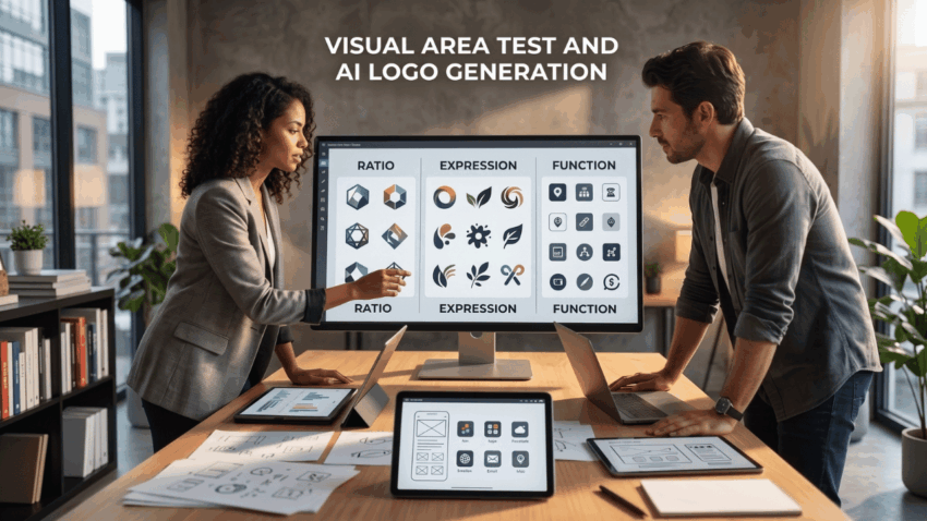
Start by writing three short briefs rather than one large, vague request. One can test a rational territory, using measured geometry and restrained color. A second can test an expressive territory, using asymmetry, texture, or a more human rhythm. A third can test a utility-first territory built for tiny icons and product interfaces. The point is not to crown a winner immediately. It is to make the differences visible enough that a team can discuss them without relying on personal taste alone.
Define what each territory must prove
For every direction, list one audience impression and one usage condition. A finance tool may need to feel calm on a small mobile screen. A community project may need to feel inviting on a poster. A technical service may need a mark that survives a monochrome invoice. This framing prevents a review from becoming a debate about which option looks “cool.”
Ask reviewers to explain what they noticed before asking which option they prefer. Their first observation often reveals more than a rating. If people consistently describe a rounded mark as friendly but cannot identify the product category, the territory has a clear strength and a clear risk. That is actionable feedback.
Build variation with controlled inputs
Generative systems are excellent at producing alternatives, yet unlimited alternatives can create false confidence. Research on creative search repeatedly shows that variety is useful when the variables are intentional. Change one or two dimensions at a time: the symbol family, the typographic voice, or the level of abstraction. Keep the business name, core audience, and use case stable while comparing results.
This is where an AI Logo Creator supports disciplined iteration. Instead of saving twenty unrelated images, make a small board of six candidates for each territory. Label them by the question they answer. For example, a founder can compare a wordmark with a compact monogram while holding color constant. In the next round, the same team can compare high-contrast and low-contrast palettes while holding the mark constant.
Look for patterns, not a perfect output
The strongest early result may be a recurring pattern rather than a finished logo. Perhaps every promising option uses a wide letterform, a narrow symbol, or a simple two-tone relationship. Those patterns tell a human designer what to investigate next. They also help a founder write a better creative brief if the work moves outside the team.
Keep a short record of what was rejected and why. “Too playful for enterprise buyers” is more useful than “did not like it.” “Fails at sixteen pixels” is more useful than “looks strange.” A record reduces circular feedback when someone sees an old direction again two weeks later.
Test the mark in ordinary situations
An appealing presentation image can hide practical weakness. A logo does not live only on a white square. It appears in browser tabs, social avatars, packaging labels, invoices, screens, and email signatures. Put the most credible candidates into rough, everyday contexts before deciding that one deserves refinement.
An AI Logo Creator can accelerate this stage, but context testing should still be modest and honest. Use a plain app-header sketch, a small profile image, and a single-color version. Do not need a full launch campaign to discover that an icon loses its character when scaled down. Likewise, do not assume a detailed illustration will translate to embroidery just because it looks impressive in a large mockup.
Invite feedback with a focused question
Avoid asking friends whether they “like” the logo. Give each reviewer one task. Ask which of three options looks most dependable for a purchase decision, which is easiest to recognize after a quick glance, or which seems most appropriate for the product described. Short, comparable answers create better evidence than open-ended compliments.
Separate familiarity from fit. A conventional mark may be easy to understand because it resembles established competitors. That can be useful, but it may also make the new brand disappear. A more distinctive direction may need refinement rather than rejection. The choice depends on the company’s stage, audience, and tolerance for visual risk.
Turn exploration into a reusable decision system
The final value of an exploration sprint is not simply a selected image. It is a shared language for future brand decisions. Once a team has named its preferred territory, it can check new illustrations, product screens, and campaign assets against the same principles. That makes the logo a starting point for a system rather than a one-time deliverable.
Before committing, write a one-page conclusion: the territory selected, the evidence supporting it, the risks still open, and the next test to run. Keep one alternative as a reserve, especially if the chosen direction has not yet been seen in a real customer context. An AI Logo Creator is most useful when it helps founders make these decisions earlier, with clearer questions and less wasted rework.
For a small team, this approach turns abundance into focus. It reveals which visual signals earn attention, build trust, and still need a designer’s judgment. A logo becomes more durable when its first direction is chosen through structured comparison rather than a hurried vote.
An AI Logo Creator should support a clear question in every review. An AI Logo Creator helps a team compare evidence instead of hunches. An AI Logo Creator can surface disagreement before it becomes costly. An AI Logo Creator is strongest when variables are controlled. A disciplined AI Logo Creator session keeps useful alternatives visible. An AI Logo Creator can reveal a scaling risk before production. An AI Logo Creator also gives collaborators a shared reference. The next AI Logo Creator prompt should reflect the last test. That is how an AI Logo Creator supports a durable learning process. A focused AI Logo Creator workflow makes later human refinement more efficient.
