
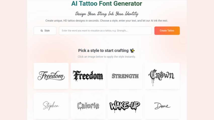
In the evolving world of body art, the “White Ink Tattoo” has emerged as a sophisticated, almost ethereal trend. Often referred to as “Ghost Ink,” these tattoos are created using only white pigment, resulting in a subtle, scar-like aesthetic that appears to be embossed onto the skin rather than drawn upon it. While visually stunning and highly discreet, white ink tattoos carry a significant technical challenge: they are notorious for fading quickly and losing their definition. Unlike black ink, which provides a sharp contrast against most skin tones, white ink relies entirely on texture and subtle highlights. To prevent a meaningful word from turning into an unidentifiable pale smudge over time, the choice of typography is the most critical decision a collector can make. This is where a high-definition tattoo font generator becomes an essential tool for ensuring long-term legibility.
The Science of Subtlety: Why White Ink Demands Precision
White ink is thicker than traditional black or colored inks, but it lacks the same chemical stability when exposed to UV rays and the body’s natural healing processes. Because the pigment is so close to the natural undertones of human skin, the borders of the letters tend to blur much faster than standard tattoos. If you select a font with thin, spindly lines or overly complex, overlapping flourishes, the “Ghost Ink” effect will eventually cause the letters to merge into a single, faint patch of textured skin.
The secret to a successful white ink tattoo lies in “structural clarity.” You need a font that has clearly defined edges and enough internal negative space to remain distinct as the ink settles. By utilizing a professional tattoo font generator, you can filter for high-definition scripts that are specifically designed for maximum edge retention. These aren’t just decorative fonts; they are mathematically balanced characters that prioritize the silhouette of each letter.
High-Definition Scripts: The Architecture of Visibility
When designing for white ink, the “Modern Sans” and “Clean Serif” categories are often superior to traditional cursive. However, if your heart is set on a script, you must look for “High-Definition” variations. These are scripts where the AI has optimized the connections between letters to prevent “pooling”—a common issue where the thick white ink builds up in the corners of letters like ‘a’, ‘e’, and ‘o’.
1. Sharp Terminations and Defined Serifs
In a white ink scenario, “soft” or “rounded” fonts are your enemy. They disappear too easily. Instead, use a tattoo font generator to find fonts with sharp serifs or “wedge” terminals. These sharp points act as visual anchors, helping the eye define where one letter ends and the next begins, even when the pigment has faded to a subtle cream or translucent white.
2. Stroke Consistency
Variable-width scripts (where some lines are thick and others are hair-thin) are risky for white ink. The thin lines often disappear within months, leaving the thick lines looking like disconnected fragments. For a “Ghost Ink” aesthetic, it is better to choose a monolinear font or a “High-Contrast” script with a minimum line thickness that can hold the pigment effectively.
Digital Simulation: Testing the “Fade Factor”
One of the most powerful features of a modern tattoo font generator is the ability to preview designs with different transparency levels. Since white ink will never be 100% opaque once healed, you should lower the opacity of your digital design to about 40% to simulate how the healed tattoo will actually look on your skin.
If the word becomes unreadable in the digital preview at 40% opacity, it is a sign that the font is too complex for white ink. This “pre-ink” testing phase is a hallmark of the E-E-A-T (Experience, Expertise, Authoritativeness, and Trustworthiness) approach to design. By using technology to anticipate the physical limitations of the medium, you ensure that your investment in body art remains a masterpiece rather than a regret.
Strategic Spacing: The “Anti-Blur” Logic
In typography, the space between letters is called “kerning,” and in white ink tattooing, kerning is your best friend. Because white ink is prone to “spreading” slightly as it heals (due to the larger pigment particles), you must increase the letter spacing more than you would for a black ink tattoo.
A professional generator allows you to manually adjust this spacing. For a white ink wrist tattoo, for example, you might increase the kerning by 20% to 30%. This extra “breathing room” ensures that as the ink settles, the letters remain individual units. This technical foresight is what distinguishes a “Ghost Ink” tattoo that looks like high-end art from one that looks like a dermatological anomaly.
Why AI-Driven Fonts are Safer for Specialized Pigments
Traditional font libraries were built for high-contrast environments—ink on paper or pixels on a screen. They do not account for the “refractive index” of skin. AI-driven font platforms, however, have analyzed thousands of healed tattoo samples to understand how specific styles hold up over time.
When you use a specialized generator, you are accessing “Tattoo-Ready” geometry. These fonts avoid “closed loops” that are too small and ensure that the “descenders” and “ascenders” (the tails of letters like ‘y’ or ‘h’) are long enough to provide a clear silhouette. For a medium as temperamental as white ink, this level of algorithmic precision is not just a luxury; it is a necessity for durability.
Placement and Skin Tone Considerations
The “Ghost Ink” aesthetic performs differently depending on the canvas.
- Fair Skin: White ink often heals to look like a delicate, raised scar (embossing). High-definition, sharp fonts are needed to provide enough texture to catch the light.
- Deep Skin Tones: White ink provides a much higher contrast, almost looking like a bright white gel pen. In this case, you can afford slightly more complexity, but sharp edges remain vital for a “clean” look.
- Sun Exposure: Since white ink turns yellow or fades when exposed to the sun, fonts used on the hands or neck must be even more robust in their structure.
The Psychological Appeal of the Invisible Mark
There is a unique beauty in a tattoo that isn’t immediately obvious. White ink tattoos are often “secrets” shared only with those close enough to see them. They represent a private form of expression. By choosing the right high-definition script, you ensure that this private message remains clear to those you choose to show it to.
Using a tattoo font generator to refine these delicate designs allows the wearer to feel a sense of control over a medium that is notoriously unpredictable. It moves the process from a gamble to a calculated artistic endeavor.
Conclusion: Mastering the Ethereal
White ink tattoos are a testament to the fact that sometimes, the most powerful statements are the quietest ones. However, a quiet statement must still be clear. The “Ghost Ink” aesthetic relies on the perfect marriage of ethereal pigment and high-definition typography.
Don’t leave the legibility of your white ink tattoo to chance. By using a professional tattoo font generator, you can select, customize, and test the structural integrity of your script before the needle ever touches your skin. Focus on sharp edges, consistent weights, and generous spacing. By combining the latest in AI font technology with the subtle beauty of white pigment, you can create a “Ghost Ink” masterpiece that remains a beautiful, legible, and meaningful part of your identity for a lifetime. Embrace the ghost, but ensure its voice is never lost to the fade.